Overview
The goal of this project was to redesign the Chapman Starbucks, creating a welcoming atmosphere and improving the overall experience for students. It was undertaken by a team of four advanced UX designers as a school project, aiming to address the inefficiencies and frustrations commonly associated with the café.
Role
Product Designer User Experience Graphic Designer
Problem
The Chapman Starbucks was known for its inefficiency and unsatisfying customer experiences. Long lines and wait times, cramped space, and low morale were recurring issues. The team recognized the need to tackle these problems and create a tailored experience for different types of customers.
The Design Process
User Interview Findings
Market Research
Our Experiment
To understand the root causes of the issues, the team conducted an experiment by visiting the Starbucks at different times throughout the day. They discovered that the longest lines occurred when classes finished at specific intervals, such as 12 pm when classes ended at 11:50 am. Recognizing the correlation between class intervals and line length, the team proposed strategies for students to avoid peak hours and experience shorter wait times.
Task Flow
The existing flow of the Starbucks hindered efficiency, as it offered only one way to order beverages and food. This resulted in students leaving the line to attend class or being late. To address this, the team aimed to redesign the Starbucks by creating multiple platforms for ordering and establishing an efficient and consistent environment.
Current Flow
New Flow
Ideation Sketches
Solution
After After extensive research, the team established goals for their project:
- We want focusing on providing a seamless and quick turnaround for users and fostering positive associations with Starbucks.
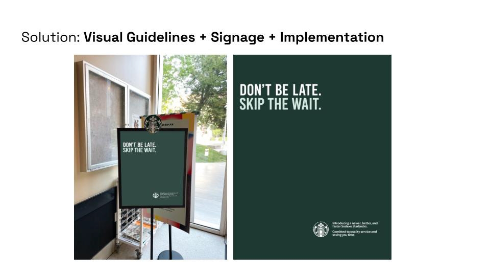
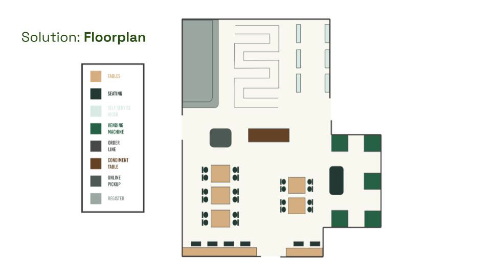
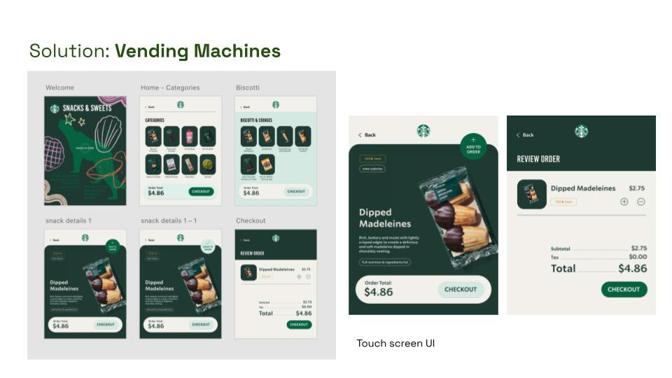
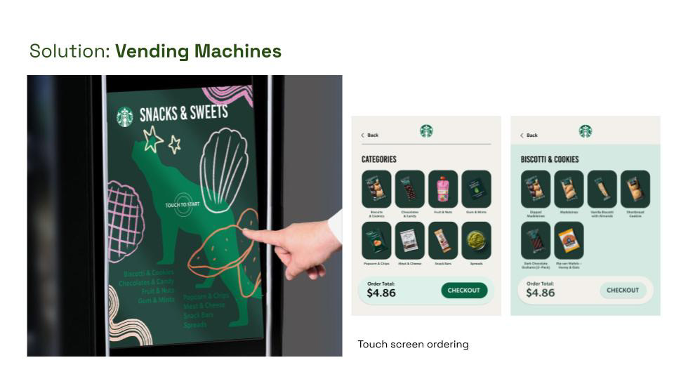
To achieve these goals, they developed four deliverables: an online ordering system through an app, vending machines for food items, in-store kiosks, a redesigned blueprint, and attractive signage. The app allowed customers to order online and pick up at designated stations, while vending machines reduced lines for food orders. A live line wait time feature provided transparency, and the app indicated peak and off-peak hours. Signage was implemented to promote these improvements across the campus.
Learning Outcome
I was responsible for the product design and UX/UI experience in the mobile app. Some key achievements during this project are listed below:
- Executed end to end. Our team conducted individual experiments to test and see how long each line would take. We also did in person interviews with students to understand their pain points.
- Applied design elements to address users pain points. I was able to effectively use the pain points in designing the Starbucks app to incorporate them in the app like a line estimate, busy hours and custom pick up times and stations.
- Implemented a design process. This allowed our team to followed a structured design process to identify the problem through user research, ideate possible solutions, wireframe our ideas and then create a final prototype.
