Overview
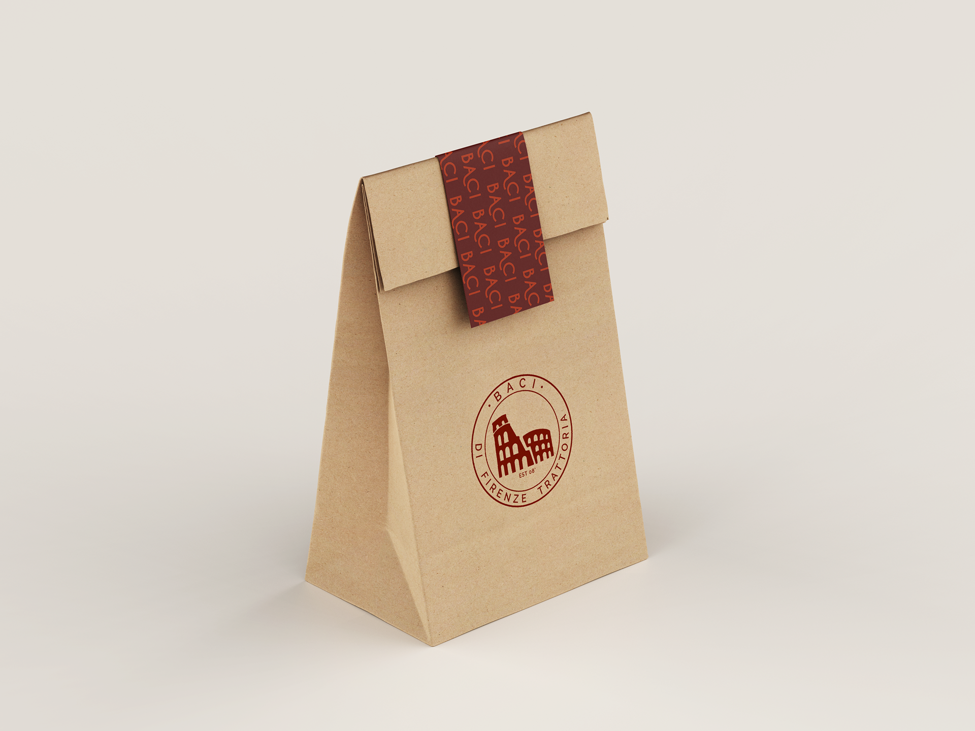
The objective of this project was to redesign a logo, menu and business cards that are functional, professional and cohesive with the branding of the restaurant. This project, rebrands a restaurant called Baci, a local Italian restaurant near my home town. The goal of rebranding this is to promote the restaurant and attract more customers within their target audience. The new menu and business cards were designed to create a sophisticated reflection of the restaurants environment.
Goals & Solution
The goal in redesigning the logo is to create a more memorable, inviting, open and exciting experience to their customers. This is be achieved by using clean, cohesive and elegant typography throughout the logo, menu and business cards. Through research most Italian restaurants use plain san serif type in their branding. In order to keep consistent with the origins of the restaurant the design uses San Serif type and plays with color, kerning and leading giving it a spacey and complete look. The goal is to create a comforting and luxurious environment to give their customers a true Italian experience.
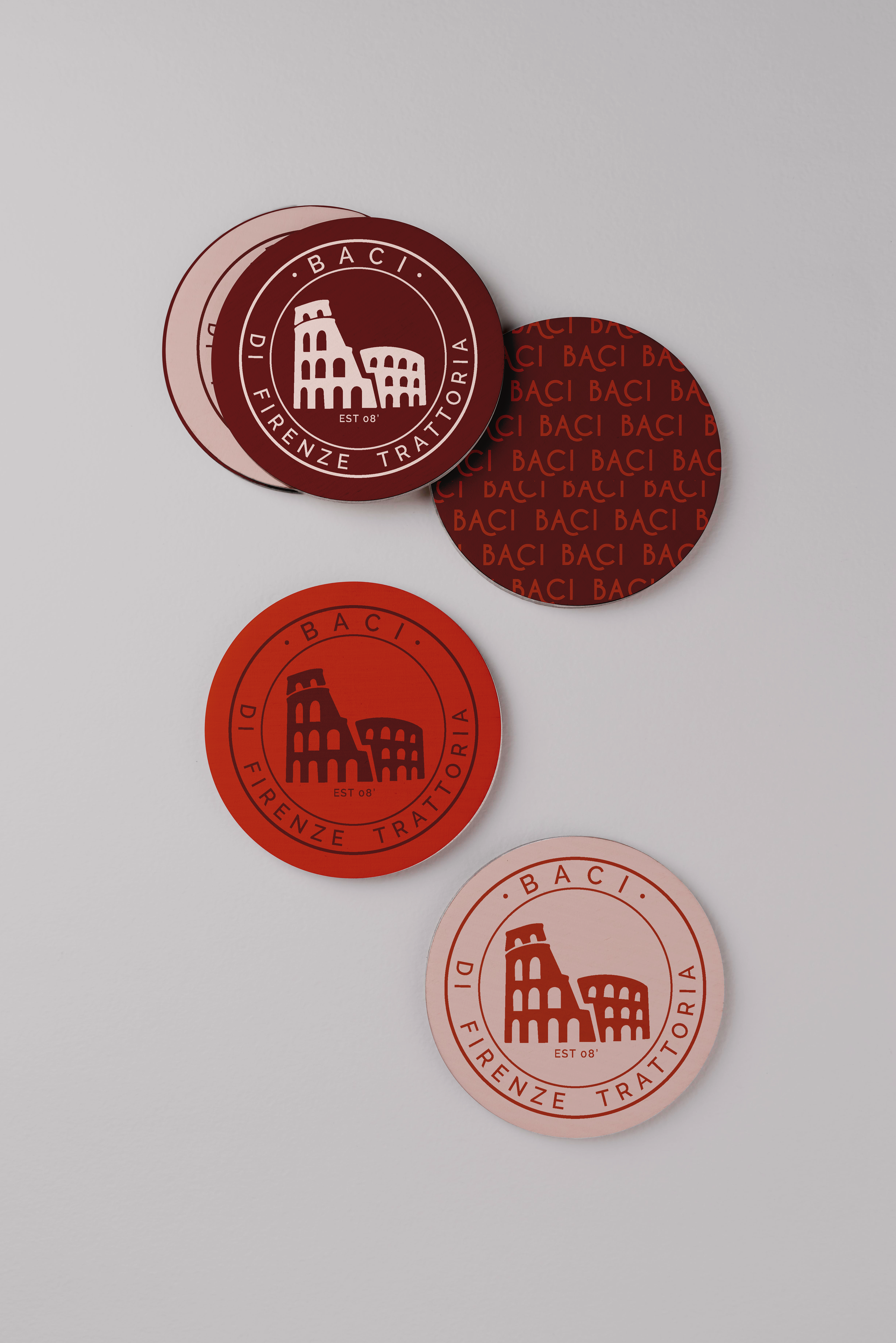
The menu includes the design element of the olive branch with a secondary logo transparent in the background acting as a stamp giving a rustic vintage feel. The lines in the background create a grid that balances the heading and the individual dishes. The color palette is a deep plum red, red and cream that symbolized the different wine choices customers would get in Italy. The deep plum red contrasts very well off the cream in the menu and the brighter red opens up the menu making it easier to read. The typeface of the logo, Cavier Dreams, creates a sense of elegance and simplicity throughout. The lowercase e of this typeface stood out to me because of the angled counters. By continuing to use the color red to highlight the A in Baci as well as adding the swoosh on that terminal adds the sense of excitement and fun to the restaurant.
This logo reflects the nature of elegance and sophistication that the restaurants food has. For the Primary Colors I chose a bright red and a deeper red. The red was used as an accent in the original Baci logo, for consistency, the rebranded logo uses similar tone of red. The business cards uses a monochromatic design style to add to the modernity of the rebrand. Both colors complement each other by allowing one another to stand out when used together. The secondary color is a light cream color that was used in the background of the menu. The cream based background allow the reds to be visible, making it easier for the customers to read the menu, even in low light.
