Overview
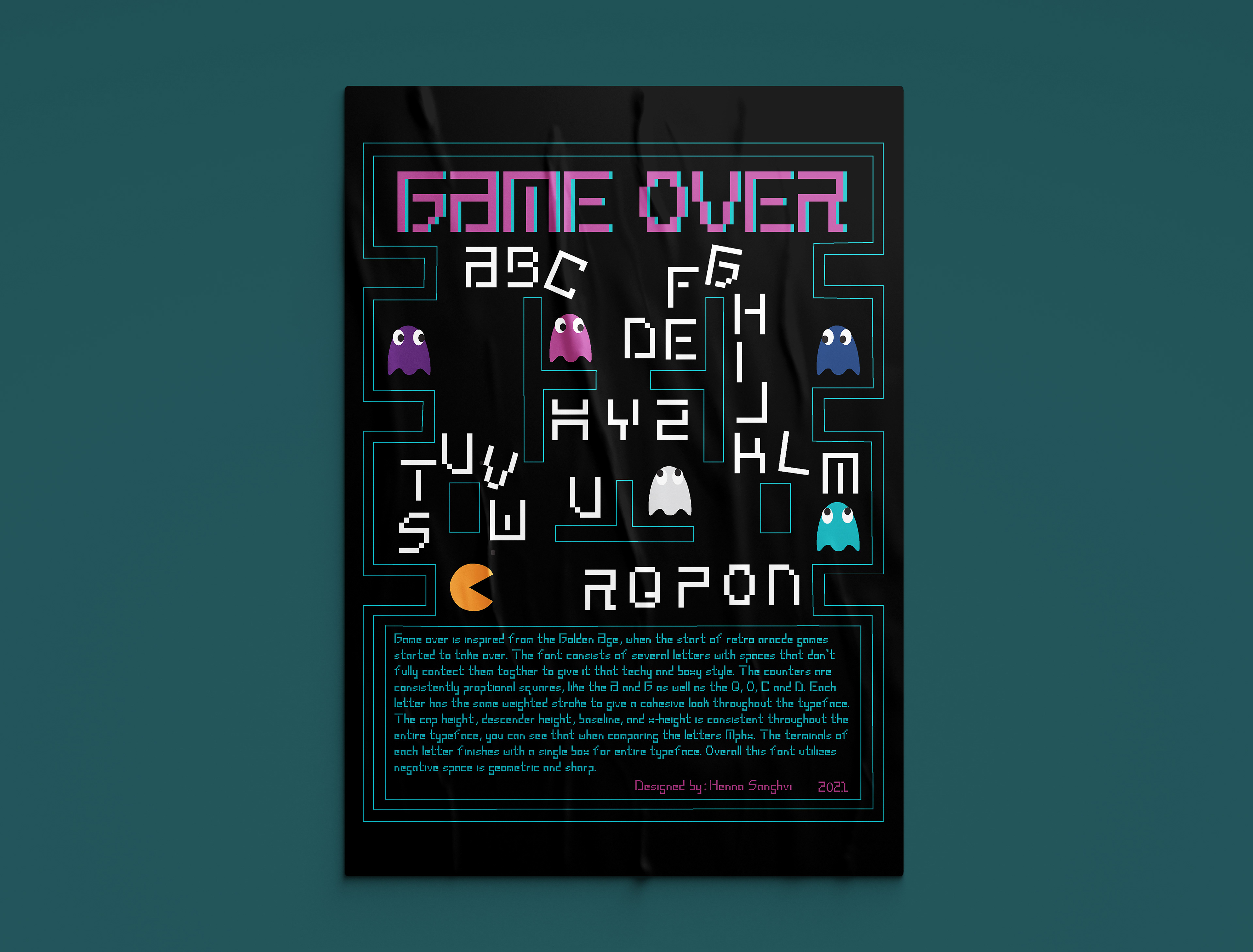
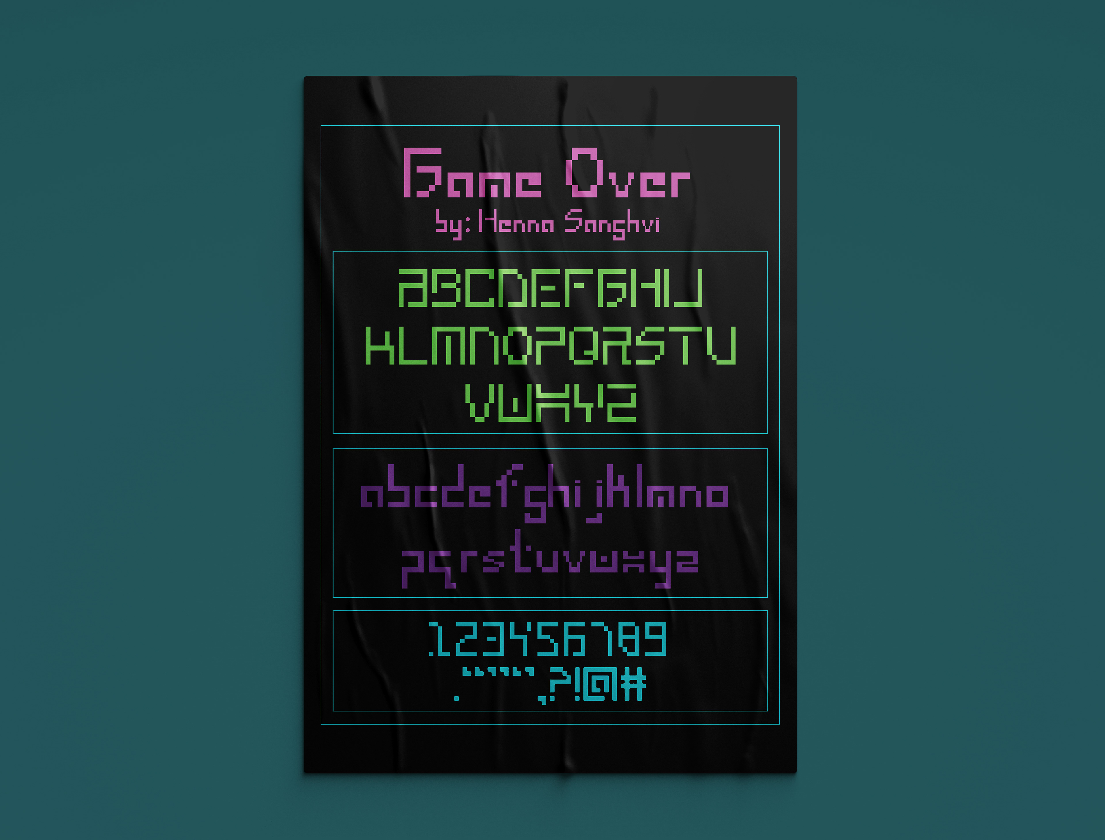
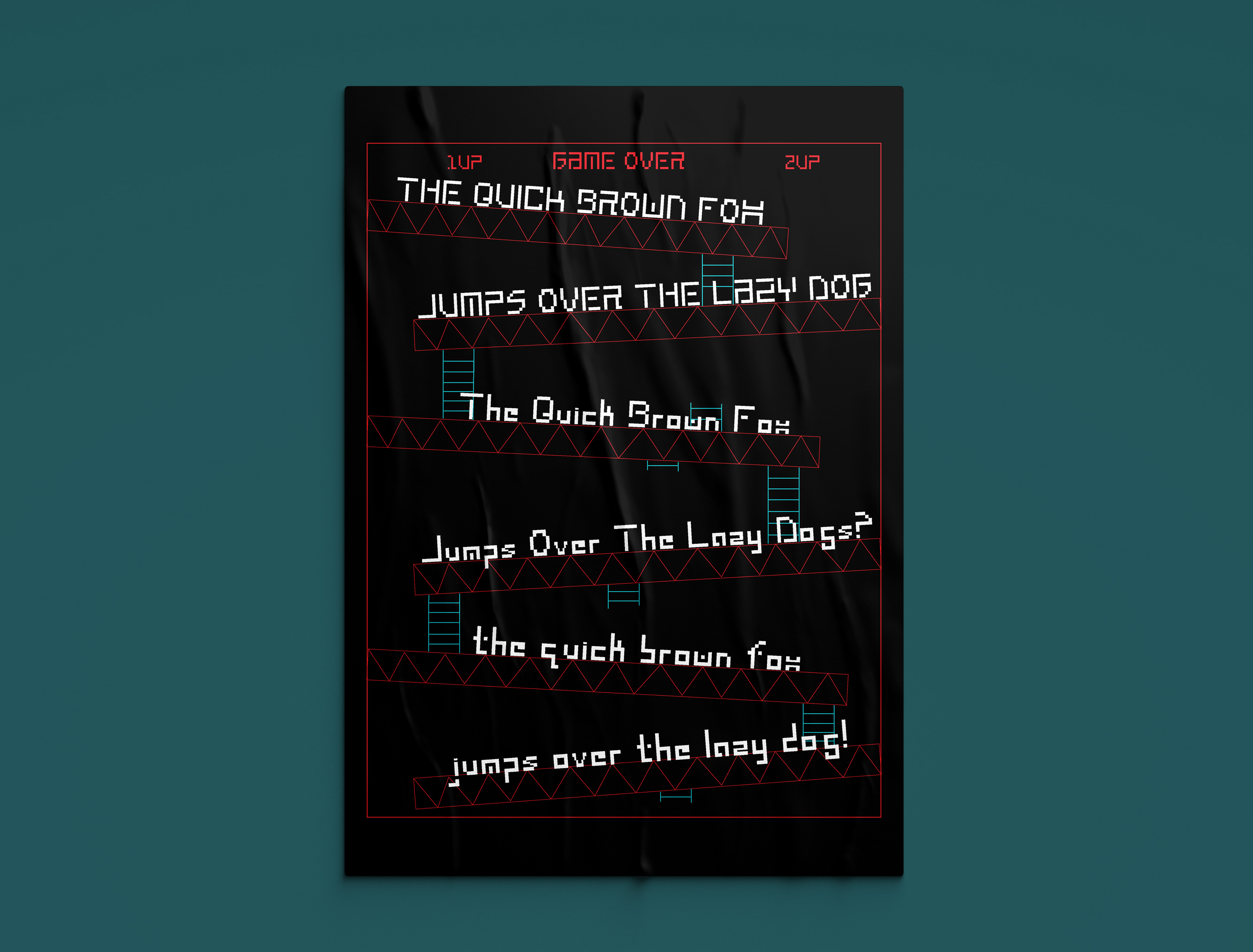
This project entails designing an original bitmap type through an online design platform called FontStruct. Bitmap fonts are comparable to superimposing a sheet graph paper over a drawn letter, like pixels. The typeface must be applied to advertisements and posters to showcase the skills and knowledge learned in typography. Game over is inspired from the Golden Age, when the start of retro arcade games started to take over. This font provides a fresh take on the classic Atari font used in retro games, to represent a new and modern take on the golden age. This typeface is displayed through a legible and cohesive vehicle, while demonstrating the knowledge of type anatomy. The font consists of several letters with spaces that don’t fully connect together giving it that tech and boxy style. The counters are consistently proportional squares, like the A and G as well as the Q, O, C and D. Each letter has the same weighted stroke to give a cohesive look throughout the typeface. The cap height, descender height, baseline, and x-height is consistent throughout the entire typeface, you can see that when comparing the letters Mphx. The terminals of each letter finishes with a single box for entire typeface. Overall this font utilizes negative space and is geometric and sharp. The posters fit this theme because they exhibit attributes from arcade games such as PacMan, Donkey Kong, and Asteroids. Each poster has its own unique element from a retro game that inspired this font. The neon colors used throughout the posters and ads stay consistent to the theme of retro, arcade and technology.
